Three types of screens
Workbenches, forms, and wizards represent three broad approaches to structuring a complex task. The correct choice will depend on the task.
Workbenches
Workbenches help users rapidly iterate and see quick feedback from their changes. Because of their non-linear interaction flow, a well-designed workbench can make efficient use of high-resolution screens.
Workbench designs vary widely depending on their purpose, but all will have a few key components:
- A preview or data output section which shows the expected results from the user’s work
- A set of controls which modify the preview section. This can be very simple (a row of checkboxes for filtering) or very complex (a complete code editor).
- Many (but not all) will have the ability to save work and return to it later. This is often accompanied by an ability to share work with other users.
There are a few good opportunities to use a workbench:
- Research Tasks - A workbench approach is typically the right choice when a user is attempting to filter or extract information from a dataset.
- Content Creation - If the user is attempting to create a work product, a workbench approach can provide a running preview of the expected output.
Avoid using a workbench when:
- The task is performed infrequently. Workbenches rely on providing quick access to a wide array of tools. It may not be worth the user’s time to learn where all the tools are and how to use them.
- The user is likely to be new to the product. New users are already struggling to get their bearings in the product. Exposing them to low-guidance, information-dense views can overwhelm them.
- When designing workbench experiences, make liberal use of progressive disclosure. Show key operations that explain the function of the screen immediately. Add uncommon actions later contextually.
Forms
Forms allow users to supply a set of inputs related to a single task.
 Forms (zeplin) Form components (zeplin)
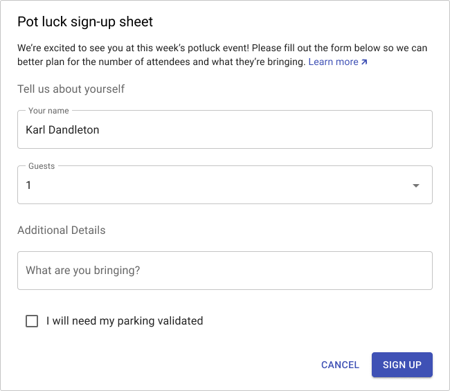
Forms may have labeled sections, but are not required to do so. If a form has sections, it must have at least two.
Forms may have a short preamble to explain the task being performed. This is also a good place to link to general documentation on the task.
The confirming button for a form should explain what’s about to happen. Avoid using generic terms like “OK” or “Submit.”
Wizards
The wizard is a modal component intended to guide users through a structured task flow.
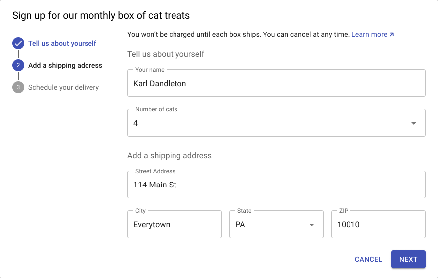
The wizard is a good choice for unusual tasks. The wizard can guide the user through the task and provide additional support (input validation, extra documentation, per-step testing).
The larger wizard task is divided into a series of labeled sections. A summary of the sections is presented on the left side of the modal or screen.
On load, only the first section is displayed. New sections are only shown once the user has successfully completed a section.
Successful completion means no validation errors and success for any backend tests performed on data gathered in the section (for example, verifying credentials).
Input validation should be performed as the user completes each section (if possible). If a later step invalidates input from a previous step, the stepper on the left should mark the offending step. In general, choices made in later steps should not break previous steps.
Input changes in earlier steps can change the contents/structure of subsequent steps. If this would cause a field to be hidden, preserve any user input if possible. If a user scrolls back up and changes a value, repeat all subsequent section validations. Mark any broken steps.
Use the “Next” button label on all steps except the last. When the user has completed all steps and is ready to perform an action, label the final primary button with a summary of the action to be taken.