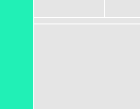
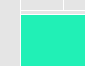
Screen structure
Screen contents are divided into five sections, each with a specific task. Consistent layout helps users orient themselves and make sense of complex screens.

Main Navigation
The main navigation appears on the left of the screen.

Navigation elements should represent broad sets of functionality exposed by the product. When naming a navigation item, use a descriptive noun (“Deployments”). Avoid using verb phrases (“Manage Deployments”). Place specific functions on the destination screen, not the navigation itself.
The list of items should be easy to scan. A novice user should be able to understand the functionality provided by the product, an experienced user should be able to quickly locate a particular piece of functionality.
Application Context
The application context includes any information which is consistent from screen to screen and relates to the installation itself, the user’s organization, the user’s account, or the user’s session.
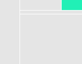
The application context area can also be used to notify the user of the status of long-running tasks or new global information (new releases, subscription or licensing changes, outages, etc). Finally, this section should be used for session and account actions (log out, manage account, etc).
Current Screen Context
The current screen context describes the purpose of the current screen, orients the screen to the main navigation, and provides any supplemental information regarding the screen contents.
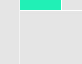
If the current screen is logically a child of another screen, this section should contain a link to the parent screen. This section should contain enough information about the current context to allow the user to orient themselves. For example, if this screen were related to a particular computer, this section should show:
- A link to the full list of known computers
- The hostname of the computer
- The operating system
- The current health and/or power state
- The location or cloud provider where this computer resides
- The date and time we last received information about this computer
Action Bar
The action bar groups controls which act upon the contents of the screen or which act against the subject of the screen or our representation of the subject.
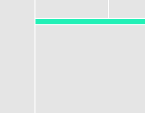
The action bar can become quite crowded! A complex screen may include many actions, a search bar, filters, and time controls. When designing controls for the action bar, consider their resting horizontal footprint. Consider putting additional information in hovers or only showing them when the control is active.
The action bar is optional. If there are no controls which affect the full screen, it’s OK to omit this section. For certain patterns (like forms and wizards) it’s typical to have the primary controls embedded in the screen content itself, where they are naturally encountered after the form body.
Screen Content
This is where the data lives. The structure of this section is highly mutable and dependent on the needs of the screen. It may be a dashboard, a single data visualization, a list of elements, or some sort of workbench or tool.
The screen contents should, inasmuch as possible, simply radiate data. Tools for exploration should be placed in the actionbar. For very complex workbench screens, it may be appropriate to locate some functionality within the screen contents. But in general we should strive to keep actions in a predictable location.