Buttons
Buttons represent an action the user can perform. There are three styles of buttons, each associated with a particular usage.

Primary Buttons
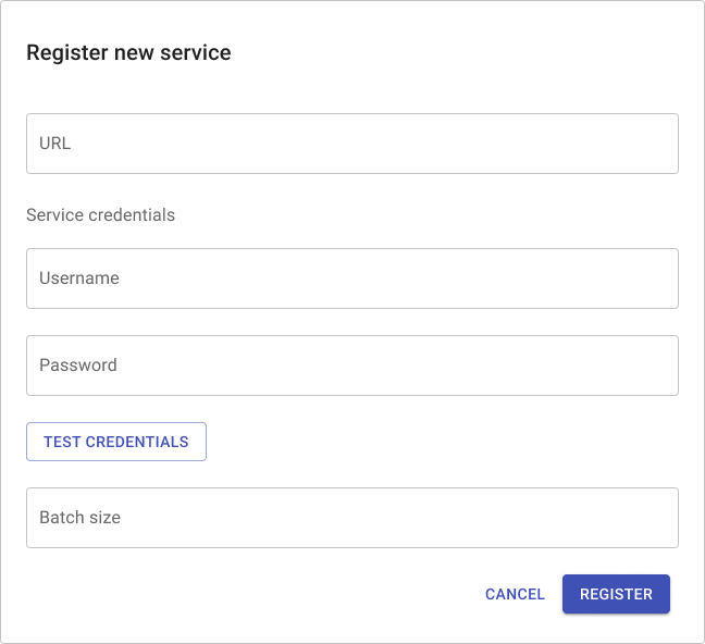
Primary buttons guide the user to what we believe is the single best action to perform given the current contents of the screen. This helps the user locate key functionality and also helps explain the purpose of the screen. There should never be more than one visible primary button.
Places where you should use a primary button:
- The submit button of a form
- The Next button of a wizard
- The primary action of a modal window
- A CTA to finish setup required to make a screen work
Practices to avoid:
- Using multiple primary buttons
- Rendering a primary button smaller than a secondary or tertiary button
Secondary Buttons
Secondary buttons are essentially primary buttons for situations where multiple buttons need to appear on a screen at the same time. If there is an obvious best choice, use a primary button to identify it.
Places where you should use a secondary button:
- Submit buttons of supplemental forms
- Submit buttons for sub-forms (test configuration, validate, etc)
- CTAs to finish setup when a primary button already exists
Practices to avoid:
- Using rows of secondary buttons
Tertiary Buttons
Tertiary buttons represent normal actions, typically unrelated to a form or larger workflow. Tertiary buttons can also be used to cancel forms, close modals, or abandon a wizard. Most actions should use tertiary buttons.
Tertiary buttons can also be grouped together to form a command bar.
Links and Hover Text
Links are special text elements that navigate to a new screen when clicked.
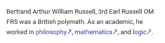
Links which navigate away from the product should have the character 🡵 (🡵) appended to any link text and should open in a new tab. Hover text is text with a related tooltip. When the hover text is clicked/tapped or simply hovered over with the mouse pointer, show a tooltip with additional information.
Disabled Buttons
An action may be disabled because the user lacks access rights to perform it, because the target is in an invalid state, because the action doesn’t sensibly apply in the current context, because other screen elements are not in the correct state, or any number of other reasons. Rather than showing the button in an unusable state, we should:
- Hide the button if the action is incoherent or invalid in the current context
- Report a validation error if the action cannot be performed
Button Dos
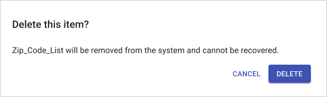
- Use descriptive labels that convey the expected outcome of clicking the button. For example, label the final button of a form “Create user” not “Submit” or “Finish.”
- For forms and dialogs, right-align buttons and order from least to most important or common. This typically means a primary button will be on the far right.
- For menu bars, left-align buttons and order from most to least important.
Button Don’ts
- Don’t use overly-long button labels. If you’re concerned a user may not understand the behavior of the button, use inline documentation to explain the expected behavior.
- Don’t place a button in the middle of a text element. Use links.
- Don’t use links for product actions, only for navigation to a new screen.
Button Caution
- Exercise caution when using icons. Some users may use the product with sufficient frequency to learn the icons, but many won’t. Whenever possible, use plain text buttons. If you find yourself tempted to use a row of icon buttons, consider reworking the screen.